Bill Rankin, 2010
download:
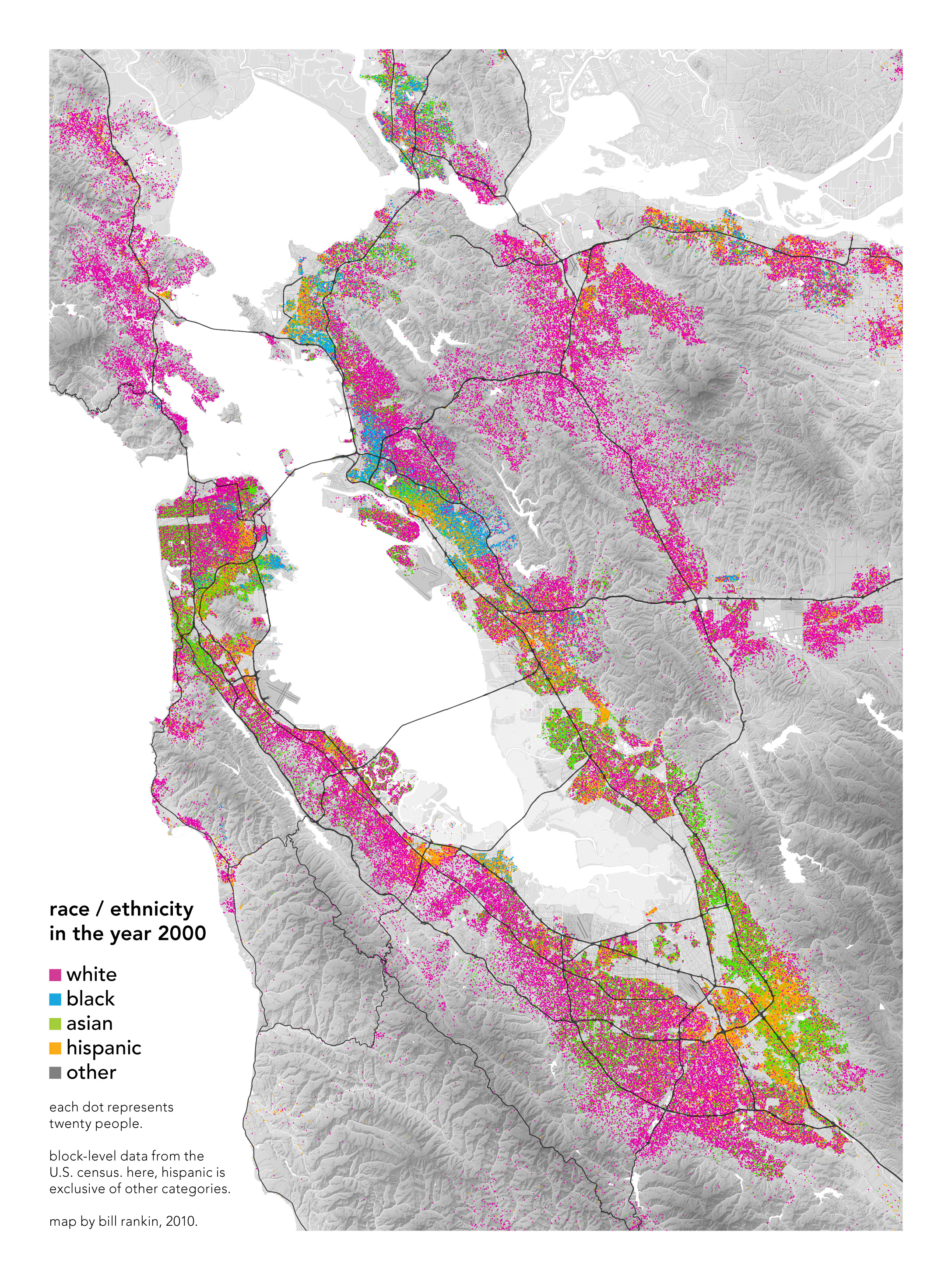
Race (2200x3000, 3.8 MB)
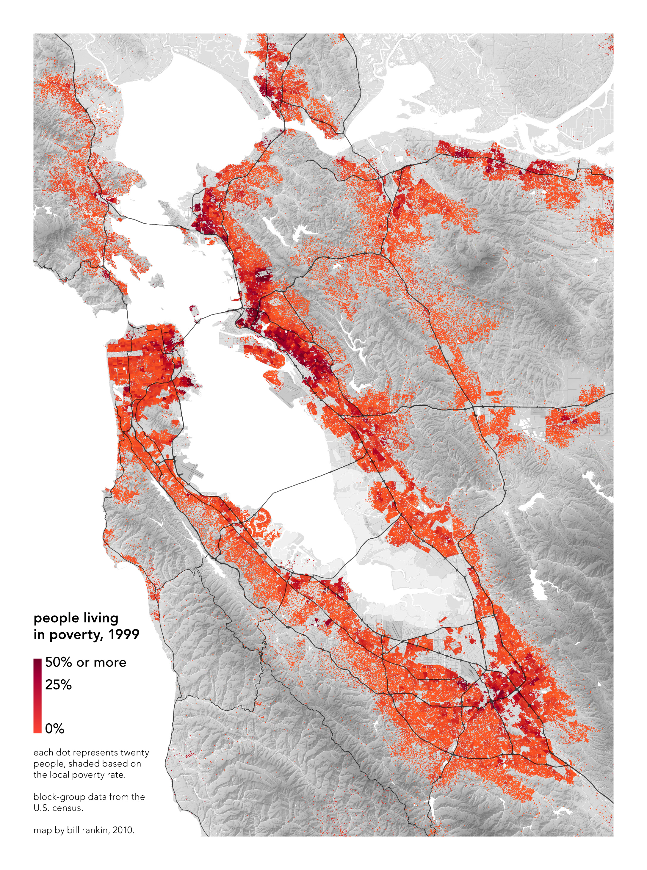
Poverty (2200x3000, 3.3 MB)
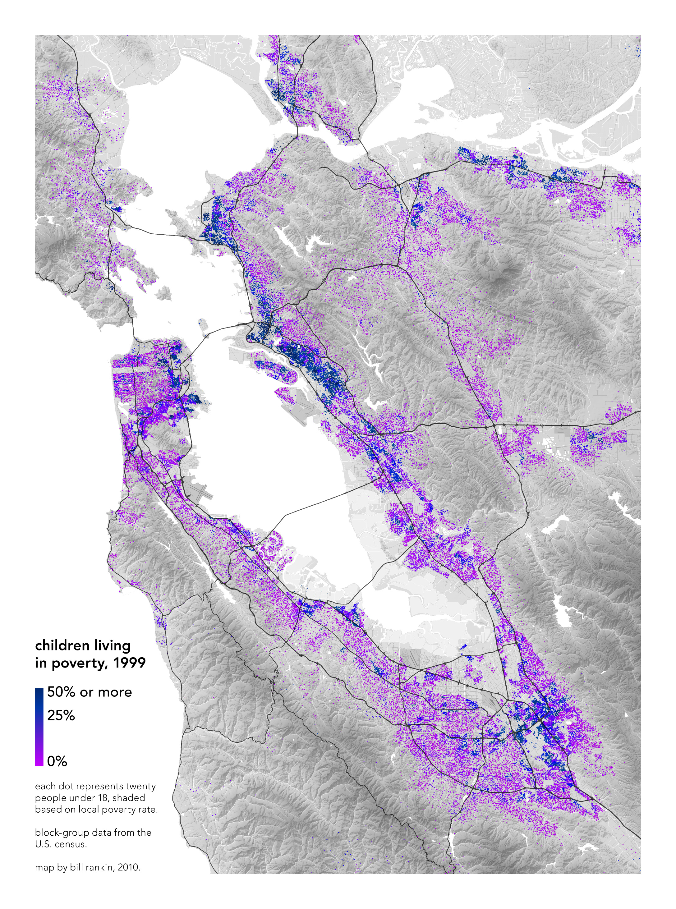
Child Poverty (2200x3000, 3.2 MB)
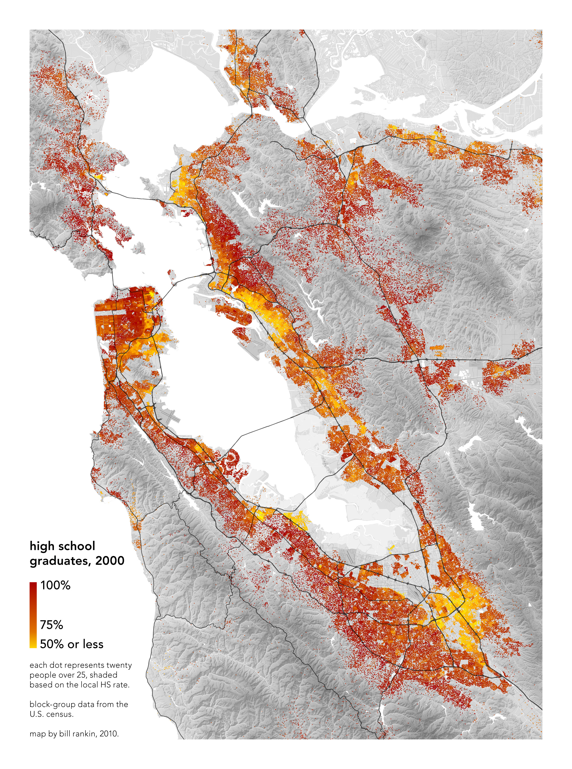
Education (2200x3000, 3.3 MB)
A continuation of the race and income maps I made for Chicago, this time for a nonprofit in the Bay Area. As with Chicago, using dots shows demographic transitions between neighborhoods and cities much more clearly than solid colors ever can.
But with the Bay Area — with its contrast between the sparsely inhabited hills and the dense coasts — avoiding the standard solid-color choropleth map is even more important. Using the same graphics for hills and coasts would give a very distorted idea of how race and poverty are distributed. Instead of a few poor areas floating in a solid-color sea of prosperity, here the relative geographic balance between rich and poor is much more obvious.
Note again, though, that race is only is only a rough predictor of other demographic characteristics. Much more salient is the close relationship between poverty and education.
