Bill Rankin, 2008
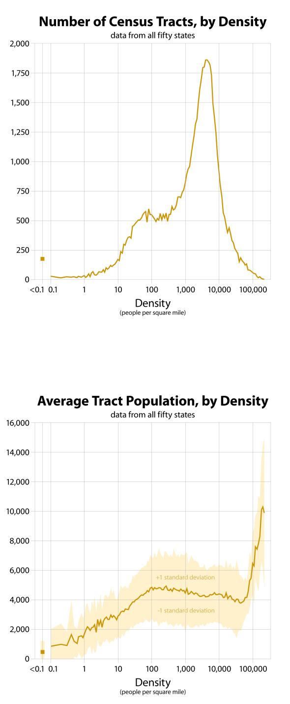
The basic units of analysis here are the census tracts from the 2000 U.S. census. Tracts do not correspond to any political divisions; they are instead sized to each contain about the same number of people. This makes them much better than counties or municipal boundaries for an analysis of density.
The first graph at right shows the number of tracts by density: the low number of tracts (and people) at very low and very high densities is the reason for the noise in some graphs in these areas. I have not done any smoothing.
The bottom graph shows the average number of people per tract. The average for all tracts is 5,236 people; it is lower at lower densities and higher at very high densities. This curve does not affect any of the variables I graphed; it only shows that tracts are a good tool to use.
One other methodological point: note that the only graphs that show standard deviation bands are plots of averages. If the value is an average for each tract individually (family size, for example), I show the spread of values across all tracts. For the other graphs, I first summed across all tracts at a given density and then found absolute or per-cent values. There is no standard deviation in this case, and the result is independent of any variation between tracts.
