|
Bill Rankin, 2008
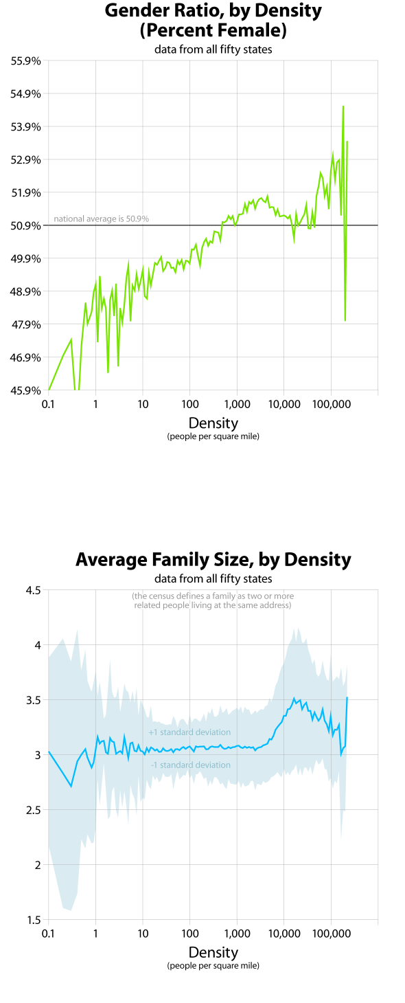
Two somewhat unexpected patterns. As a group, women tend to live at higher densities than men, and at very low densities women are remarkably underrepresented. Compare this graph to the income graph; at densities greater than 1,000 people per square mile, the shape of the curve is quite similar.
The second graph shows average family size by density, again for all fifty states. Notice that the pattern at high densities is exactly opposite of the first graph; just as the percentage of women is declining, family size increases, and vice versa. But here the correlation with per capita income makes more sense: given the same amount of household income, larger family sizes will correspond with less income per capita. The change in family size, however, is a bit less than the change in income. It’s not a complete explanation.
One of the overall goals of this series of graphs is to pinpoint discontinuities in density patterns. Might these graphs help understand where "suburban" ends and "urban" begins? What values should be used when shading density maps? Looking at all the graphs together, it seems there are discontinuities at approximately 10, 250, 3,000, and 20,000 people per square mile. These would correspond to sparse, rural, suburban, urban, and central-city densities. I’ve made a simple map of the U.S. with these break-points.
All graphs based on tract-level data from the 2000 census. Data do not include U.S. territories. For more information, see this quick discussion of my data.
