|
Bill Rankin, 2008
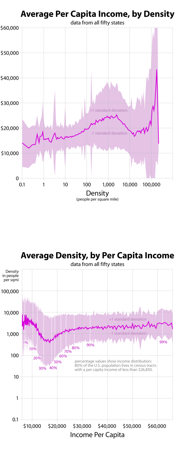
These graphs both show the relationship between income and population density in the fifty states, but switching the independent and dependent variables gives two different insights into income patterns. The first graph suggests that there are two densities that people are willing to pay for: low-density suburban (or even ex-urban) living, and very high urban density. This certainly corresponds to the simple income donut model of urban income distribution, but this graph suggests that density might provide a better explanation than proximity to the center.
The bottom graph provides evidence for another bit of conventional wisdom: the lack of an urban middle class. The poor and the rich both live in the city (the poor at slightly greater average density than the rich), but middle-income areas tend to be more dispersed.
While there are similarities here with the data on gender and family size, income distribution seems remarkably independent of racial, ethnic, or age distributions, none of which show changing patterns around 1,000 people per square mile.
One of the overall goals of this series of graphs is to pinpoint discontinuities in density patterns. Might these graphs help understand where "suburban" ends and "urban" begins? What values should be used when shading density maps? Looking at all the graphs together, it seems there are discontinuities at approximately 10, 250, 3,000, and 20,000 people per square mile. These would correspond to sparse, rural, suburban, urban, and central-city densities. I’ve made a simple map of the U.S. with these break-points.
All graphs based on tract-level data from the 2000 census. Data do not include U.S. territories. For more information, see this quick discussion of my data.
