Coming up for air just briefly to post a fun project with Dániel Margócsy tracking the spread of Andreas Vesalius's famous De humani corporis fabrica — the foundational work of the Western anatomical tradition — from 1600 to the present. Dániel and his collaborators have just published a book about their findings, and I helped map their data to show how copies of the Fabrica have been gradually displaced away from their European birthplace. The big shift happened when the new money of the US, and later Japan, began collecting old books as prestige objects.
Some bonus charts also appear in an article in Slate about how the Fabrica was read — especially for the sexy bits.
10-26-17
I'm excited to say that my arborregions project is a finalist for an "Information is Beautiful" award! If you're reading this before midnight on Sunday 10/29, could you spare a moment to follow this link and click VOTE for me? Most of the finalist projects are by professional media outlets, and I'm one of only a handful of individuals on the list. I'm looking for any clicks I can get!
Thank you thank you!
01-31-17
I'm happy to share two further iterations of my recent slavery mapping.
First, a collaboration with Matt Daniels (of Polygraph fame) on the historical-geographic relationship between slavery and mass incarceration. Besides showing a remarkable overlap between the two (especially for prisons, but also for short-term jails), this was also an opportunity to put my new bubble-grid mapping technique to good use in an interactive narrative. Because the bubble grid doesn't rely on jurisdictional shapes, it's great for comparing data over very long time spans (200+ years) and for showing urban and rural population at the same time. This project is the second installment of The Pudding, a series of weekly visual essays for 2017. ("The proof of the pudding...")
Second, Michael Ralph and I have published an expansion of our slave-insurance map in the January issue of Foreign Policy. The size of our database increased from about 700 policies (in version 1) to over 1300 policies; the new policies are mostly from the archives of Baltimore Life. The overall pattern is similar — steamboats on the Ohio River, coal mines in Virginia, and skilled labor in Atlantic port cities — but the new data also includes more industrial occupations and information about slave values and premiums.
10-19-16
Autumn is here — it's time for trees!
Three tree-related projects. First is a relatively simple (but data-intensive) rethinking of tree distributions. Instead of the usual species-level blob maps, I've made a series of maps showing the actual distribution of major tree types, plus some interesting higher-level patterns.
I've then used this same data as a starting point for a new kind of bioregionalist mapping: instead of a few discrete forest regions, I'm defining "arborregions" based on the similarity between a specific place and its wider surroundings. If bioregions are really meant as an alternative to the arbitrary lines of political jurisdictions, they should challenge not just the specific boundaries, but the hardness of those boundaries as well.
Finally, I've also taken a close look at every street tree in New Haven. After the ravages of Dutch elm disease, it turns out that Elm City doesn't actually have that many elms. Instead the city is a weave of a half dozen major tree types, with dozens of others scattered throughout.
And a quick bonus map, too: the apizza region of central Connecticut!
07-01-16
There is a book! At long last, there is a book!
After the Map: Cartography, Navigation, and the Transformation of Territory in the Twentieth Century has just been published by the University of Chicago Press. More info — along with high-res images, raw data, and a bibliography — is available on the book's website, www.afterthemap.info. I've spent almost a decade researching, writing, and revising this thing; I hope you like it!
To buy the book, the best prices are listed on bookfinder.com.
05-23-16
A quick bonbon! The global distribution of human beings by altitude: a histogram showing the number of people living at every elevation. Not surprisingly, coast-loving humans are a low-altitude species, and the distribution of humans is quite a bit lower than land in general — not even counting ice domes and barren deserts. Quick take-away: when you look out from the top of the Washington Monument, you are higher than half of everyone else in the world.
I also found some additional data for the early decades of American slavery: 1790 data for what's now Tennessee, plus small tweaks to coastal South Carolina and Indian lands in Kentucky before 1820.
05-06-16
The last of my trio of slavery projects: an interactive map of slavery in the north, town by town. Although it's easy to overlook northern slavery in comparison to its huge presence in the south, at the founding of the United States it was a serious part of the northern economy, especially in areas in New York and New Jersey first settled by the Dutch. Over two thousand slaves lived in New York City in 1790, and more than 60% of white families in what is now Brooklyn were slave-owners. Nearly every town in Pennsylvania, Connecticut, and Rhode Island had at least a few slaves.
The main task of this project was getting the data, but I'm also trying some new techniques for blending interactive and static mapping. Town-level data has always been available for the north (at least after a bit of math), but it has never before been mapped or digitized. Not surprisingly, disaggretating 90 counties — many huge and unhelpful — into 1,600 towns means that new patterns emerge, and it's possible to connect broad trends with local reality in a new way. The interactive map gives detailed information about every town, but I've also made sure that the project can be downloaded as a stand-alone digital poster.
04-22-16
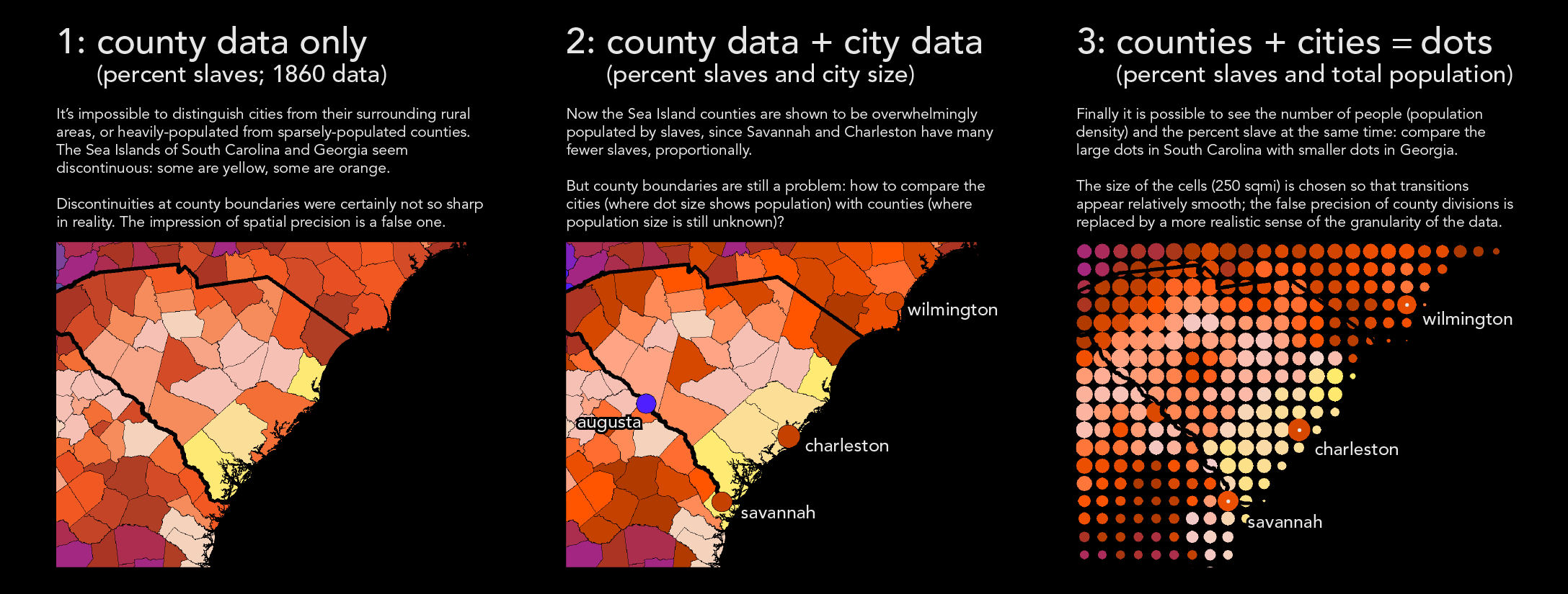
I'm pleased to share a major new project on the history of slavery in the United States. Even after 155 years of mapping slavery, there are still serious shortcomings in most typical maps. My strategy looks for a way around the straightjacket of county-based data and the false impression of spatial precision implied by sharp county boundaries. I incorporate historical data on more than 150 cities and towns; I also use dots instead of counties. Not only does this help to distinguish rural and urban areas (which often had sharply different levels of slavery), but it makes it possible to see population density and the predominance of slavery at the same time. I've posted a graphic explanation of my strategy here.
The project also includes a map of "peak slavery" that shows the maximum number of slaves that ever lived in an area, along with the year of the peak. In the vast majority of the south, slavery was booming right up to the Civil War; only in Delaware, Maryland, and eastern Virginia was slavery in natural decline.
04-11-16
Two things!
First is a collaboration with Michael Ralph on the history of slave insurance in the US. Most insured slaves were highly skilled, and they were disproportionately urban. They were usually rented to others — especially on Ohio River steamboats, in Virginia coal mines, and in skilled trades in Atlantic port cities. In many ways, what we see on the map is an unfree version of the emerging relationship between life insurance and wage labor in the north. And we know their names.
Second is a new version of my map of world railways, updated with new data and a much-higher-resolution download!
09-12-15
The final edits on the book are now done! Stay tuned for the great unveiling of After the Map in the spring, probably late March.
In the meantime, I had some fun with hemispheres.
1. Following up on my graphs of population by latitude and longitude from a few years ago, I got curious about other ways to divvy population besides the usual hemispheres of Northern/Southern and Eastern/Western. The big discovery was the Human Hemisphere, which is the hemisphere (out of all the infinitely many possibilities) that contains the most people. But we can also go one step further and calculate the population of every possible hemisphere — including your hemisphere!
2. The other hemispheric enjoyment was a slightly ironic update to Richard Edes Harrison's iconic "One World, One War" map from 1942. Instead of showing a global war of convoys and transcontinental bombers, my version — "One World, One Market" — shows global capitalism interconnected by ships, railroads, and container ports.
3. I also made some quick maps of the land and water hemispheres for Wikipedia.
Finally, on a notably unhemispheric note, I added a quick graph showing the changing demographics of New Haven since 1790. This has likewise found its way to Wikipedia.
10-14-14
Another big hiatus! I've been busy finishing my book (on the history of mapping in the 20th century) and caring for my new baby [!], which unfortunately hasn't left much time for making new maps.
But I'm really pleased to have three of my maps appearing in The Best American Infographics 2014 — just released today! And I'm not at all ashamed to admit that being in a book with an introduction by Nate Silver makes me unreasonably excited. One of those childhood dreams I never knew I had?
Also, as a follow-up to Aaron Reiss's interview–profile of me for The Atlantic's CityLab, where I discuss my five favorite maps, I have posted the full set of ten maps that I originally chose for my "long list," before Aaron and I eventually whittled it down to the final five. Enjoy!
10-03-13
This week I've been a panelist on a Guggenheim Museum forum about space, place, and representation as part of their new exhibit of contemporary art in South and Southeast Asia. So far there have been three rounds of posts; the moderator is the editor of Cabinet magazine, and the two other panelists are an artist and a writer. It's been a good conversation about "spirit," nostalgia, and bottom-up mapping.
This afternoon I'll be taking part in a live chat with the moderator. It would be great to have the conversation be as lively as possible — take a look and join us! Come one, come all! The chat will be at 2pm Eastern.
On a completely unrelated note, I also made a quick map of the alphabets of Europe.
07-29-13
What did Europeans actually discover during the Age of Discovery? According to American Indians, not much. But I've been curious about those isolated parts of the world that really were unknown to humans before the 15th century. So this weekend I went ahead and made a map of Europe's original contributions to geographical knowledge, as subject to peer review by the rest of humanity. It mostly shows a bunch of small islands and a whole lot of ice.
The take-away isn't just that humans had already spread around the world by the time that Europeans started looking for new trade routes and tropical riches. There's also an important lesson about the ability for non-Europeans to navigate vast distances and reach most of the world's islands first.
(Note that the research for this map was not always straightforward, as it required integrating present-day anthropology with sometimes-vague historical material. If you know something that I don't know, please let me know!)
05-24-13
Another quick weekend bonbon! I'm very pleased to post a map that Aaron Reiss made for Hannah Weyer's forthcoming novel On the Come Up. It shows the neighborhood of Far Rockaway, Queens, as seen by the central character in the book it's something familiar, comfortable ... and isolated. (It's also a good contender for the best use of white space in all of New York City.)
Enjoy!
05-03-13
For your weekend enjoyment, an indulgent exercise in nuance and beauty.
I picked four of the flattest areas I know (and love) and decided to make their flatness sing with the power of a thousand mountains. The result: a series of unfamiliar and wondrous microtopographical landscapes.
Now let's go climb some imperceptible cliffs!
04-29-13
Oop! I thought of another question.
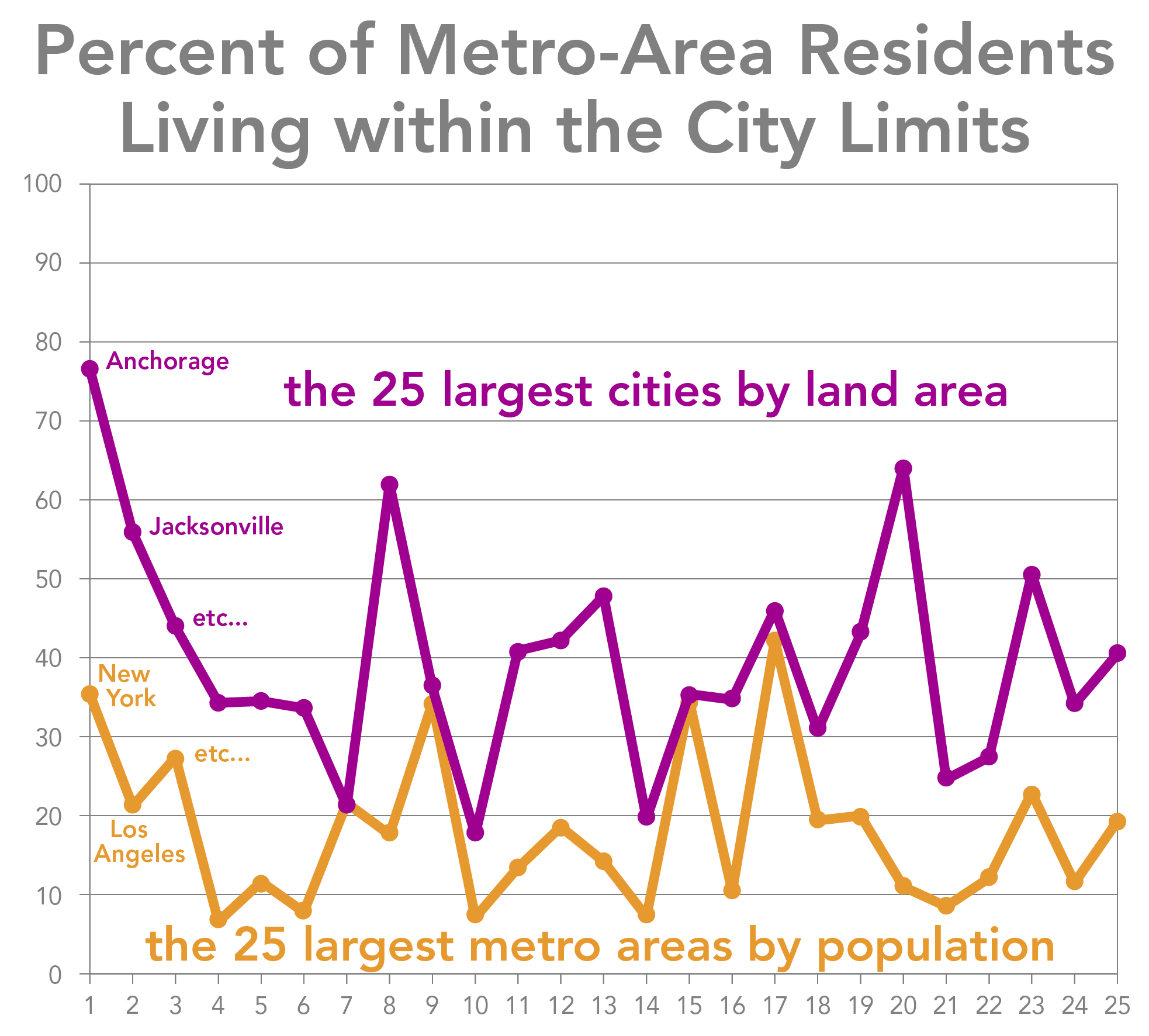
What's the biggest city in the United States New York? Los Angeles? How about ... Anchorage! After spending an evening exploring the politics of metropolitan annexation and citycounty mergers, I made a quick series of maps of the inkblot patterns of municipal limits all in comparison to Rhode Island, naturally.
I've also been interested in the contrast in identity-space between the geographically large cities of Texas, Arizona, or Southern California and geographically small cities like San Francisco, Boston, or Washington DC. The contrasts can often be striking: only 8% of the residents of the Boston metro area actually live in Boston proper, while almost two-thirds of the metro residents of San Antonio live within the city limits. Do geographically larger cities enjoy more civic-mindedness, in addition to a wider tax base? My gut says yes, but I'm afraid I don't have any actual evidence yet.
04-28-13
Happy spring! It's a beautiful day for maps. I have three questions for you.
1. Where's the Midwest? I went searching, and the results are in.
2. Where's my family from? After a few months of getting dorky with old governmental records, I have some answers.
3. What's for lunch? Animals? Plants? Fungi? Algae? It's a cornucopia of Darwinian delights. (I suppose these aren't really maps in the geographic sense. But perhaps we can see them as maps of time?)
03-17-13
My eight-year-old niece just asked me how many times people in France kiss each other when they say hello. I remembered a fun web-survey project from a few years ago, but I thought that the maps shown on the web simplified the data too much, with each administrative département shaded a solid color the tyranny of the majority! So I did a quick redesign using the same data, and voilà, we can now see the regionality of French greetings with much more nuance.
The sensibility here is similar to my other dot maps, but by doing a bit of math I found a way for ArcGIS to make smooth pointilist color mixes. The result is a hybrid of dot map and choropleth that seems quite promising for this kind of discrete data.
11-26-12
Whew, it's been a while! Teaching has kept me busy, but now it's time for an update.
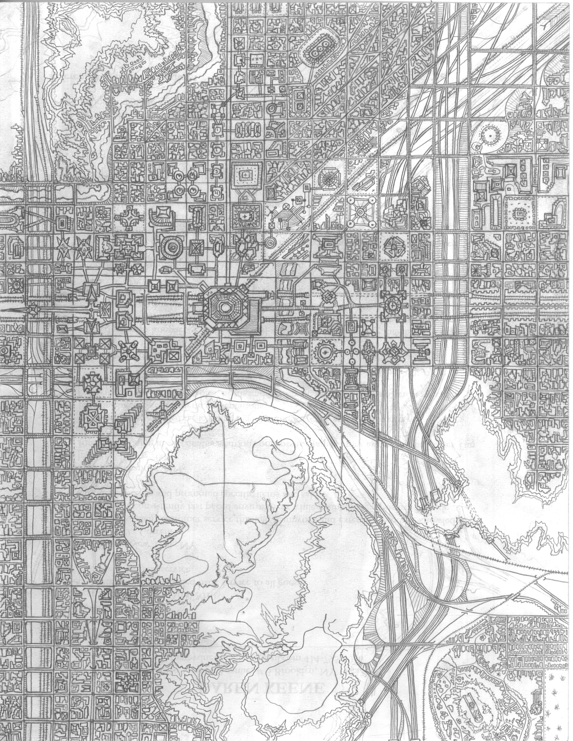
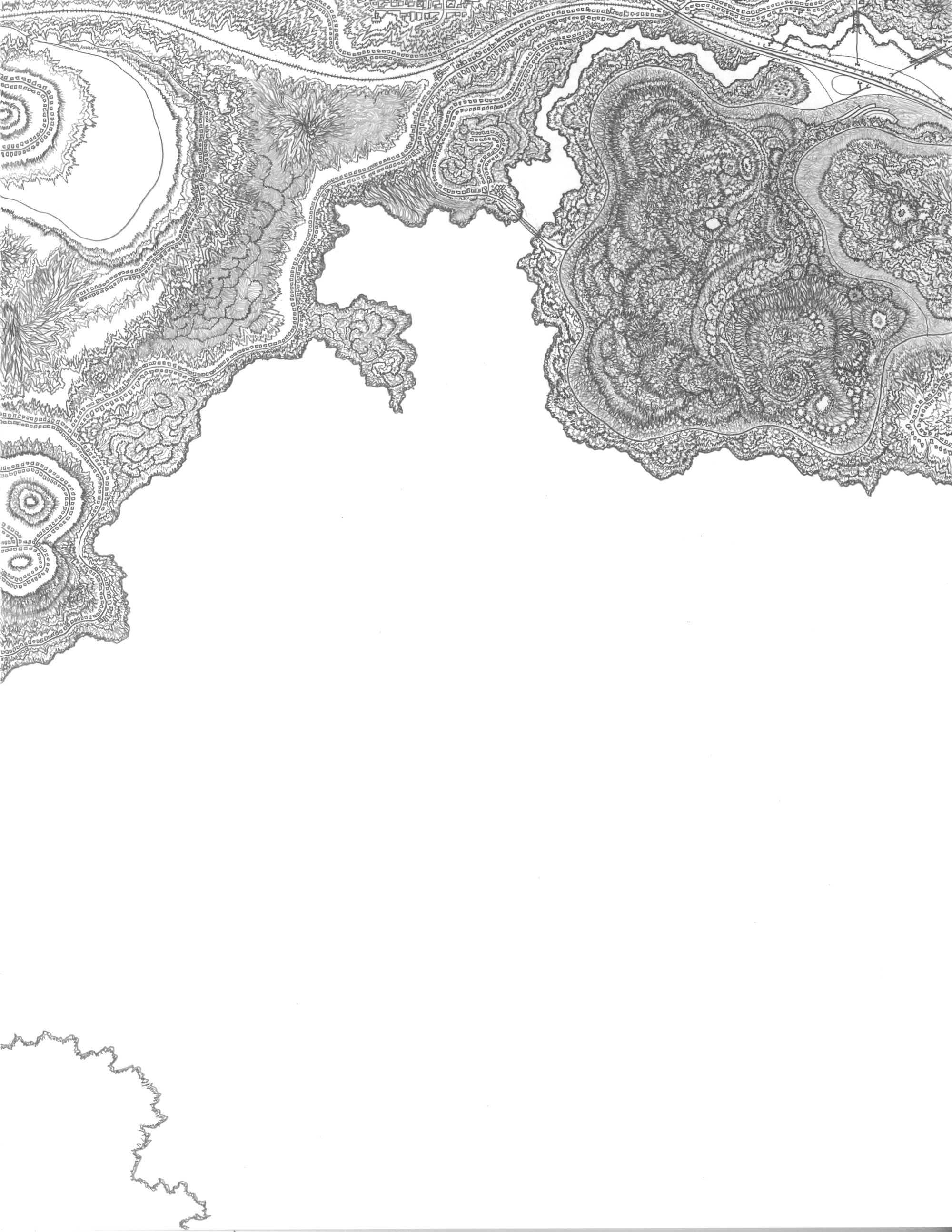
I'm very pleased to present a project by Daren Keene, who has been drawing a magical sprawling imaginary city using only a pencil and dozens of 8½" × 11" sheets of paper. Appropriately enough, he's named his city Pencilvania. Daren's maps share a sensibility with the well-known project by Jerry Gretzinger, but the aesthetic is quite different. Daren's maps mix high-tech, organic, and topographic forms into an incredibly detailed landscape that seems to oscillate between cartographic verisimilitude and pure abstraction. Start exploring!
I've also added several maps of my new home, New Haven:
Maps of age, race, and income.
Maps of foreclosures since 2008.
A map of public housing.
A map of wonderful things to do, contributed by Aaron Reiss.
Working with my fellow historian Sarah Potter, I made some historical maps of segregation in Chicago. These maps have appeared in Sarah's article in the Journal of Urban History and will also appear in her forthcoming book.
Would you like some simple wall maps of housing development in the DC/Baltimore area? They do a nice job showing the transitions between urban, suburban, exurban, and rural.
Finally, I also made some quick diagrams showing the relative sizes of the planets and added data for Venus to my planetary histograms. Exciting times indeed.
05-13-11
A couple quick follow-ups to my dot maps of Chicago.
First, I made some similar maps for the Bay Area showing race and ethnicity, poverty, and education. Standard solid-color statistical maps are especially problematic in areas where there's a huge contrast between sparsely populated and dense areas, as is in many western American cities.
Second, I made a short video explaining my Chicago map, which recently won a mapping contest in Switzerland. Here it is! Enjoy!
02-07-11
A motley collection of updates to help us through the winter!
First, Andrew and Brian Jones have done an amazing thing. After Brian saw my astronomical calendar for New Haven, his brother Andrew decided to write a program that could make similar calendars for any place in the world. It's great! I've helped with some of the code and written a front-end interface to put the script on the web now you can make your own calendar with just a few clicks. We've included all sorts of options, including the option to just let the script do everything automatically. Enjoy! (And please let me know if you run into any bugs.)
Second, I'm very pleased to host a project from Roberto Casati, Magda Stanová, and Stéphanie Roisin on the typologies of blocks and islands in Venice. It's a simple idea taken far beyond the ordinary. And the colors! Signor Nolli would be proud.
Third, I've created a response of sorts to Ben Fry's map of all the streets in the contiguous United States. By tracking down some good data for both the U.S. and Canada, I've made a map highlighting the real discontinuities of infrastructure policy on either side of the 49th parallel, rather than the data discontinuities that jump out in Ben's project. (This is no critique of his work; until recently, finding good road data was not easy.) The goal here is to see what kinds of questions we can ask once the data problem gets under control. This is especially relevant for understanding boundaries, since the idea of a boundary, the administration of geographic data, and the ground truth of geographic transitions are always intertangled.
Fourth, I had a short essay appear recently in the Boston Review, along with some more maps of race and income distributions in U.S. cities. I'm especially interested in challenging the inner city as a geographic euphemism, following up on those income donut maps I made a few years ago.
And finally, I added a link to the wonderful work of Armelle Caron. Lovely!
10-03-10
Perhaps not exactly a geographic map, but it is a mediation on place: I've made a two-year calendar for New Haven, Connecticut that shows the intertwining rhythmicity of astronomical and cultural times, all of which depend on location.
Astronomically, this calendar is valid for four points on the earth, all in the United States (in Connecticut, Illinois, Nebraska, and Nevada). With some easy modifications, however, it would apply to all points around the world at the same latitude, and could be used without much trouble a few degrees north or south as well.
05-07-10
Another geographic mashup! Oh boy!
05-04-10
One last little bonbon before I have to put things aside for a while. What would happen if the 48 contiguous states decided to traipse around the world, jumping from sea to sea in search of fun, excitement, and new markets? The cultural story is perhaps a bit too complex for a small online map, but the physiographic answer is here.
05-03-10
Feeling patriotic?
04-30-10
I've posted a quick update to my U.S. demographic maps. I changed from tract-level data to zip-code data (it seems a more intuitive metric), and added data for Alaska, Hawaii, and the populated U.S. Territories, and expanded my racial categories to include people who self-identify as multi-racial.
I also uploaded high-resolution files. Enjoy!
04-25-10
Nearly every U.S. city is radically (and disturbingly) segregated, with stark divides of race, ethnicity, and class. I've been playing with various ways to show these divisions, using graphics which are equally evocative, provocative, and rigorous. I've posted two new projects, showing two possibilities: one for Chicago, and another for New York.
In both projects I'm reacting in part against maps which show ethnic areas using solid homogeneous colors, often highlighting only the majority group such as this Wikipedia map of Bosnia and Herzegovina, or this New York Times map of Pashtuns in the Sulaiman Mountains. Not only do these maps fail to show local diversity or ethnic overlaps, but they visually reinforce the all-or-nothing logic of national territorial statehood that made the conflicts in question so intractable in the first place. These cases are crying out for new forms of mapping mapping which could directly provoke new ways of thinking. (In other words, radical cartography to the rescue!)
I have high hopes of using such alternative cartographies to make a comparative series showing the morphologies of segregation across all major U.S. cities (something similar to my income donut project), but alas, for now I'm working on a city-by-city basis. In the meantime, see my wall maps of Phoenix for a different version of this same sensibilty.
As always, comments heartily solicited, and much appreciated!
04-16-10
A few years ago I made a physical atlas of the world. The goal was to take on the general reference atlas I wanted to see if I could radicalize it a bit while still staying within the bounds of genre. I think the result was reasonably successful, and a big paper copy is now sitting on my shelf. But I quickly realized that I'd need a lot more time, and many more collaborators, to really make anything of it, and as a pulp-and-ink project it remains at the proposal stage. So why not post it to the web instead?
Drop me a line I'd love to know what you think!
04-14-10
I think we'll all agree on what the world needs now. High-resolution, ready for printing!
03-08-10
I'm very excited to be able to post a project by the Chicago artist Brett Ian Balogh. Brett does a lot of work with sound and space, and he's made a great series of maps showing how the geographies of the three major US megalopolises are inscribed in the invisible "Hertzian space" of the broadcast mass media. Take a look: Boswash, Chipitts, and Sansan. Reimagined government data strikes again!
Like what you see? Why not drop Brett a line and let him know!
12-04-09
Gems of pure beauty, found buried in a government website. I'm reformatting and reposting some USGS maps of planetary geology, for your health and enjoyment. They're lovely! Five rocks to choose from:
mercury,
the moon,
mars,
io, and
ganymede. My thanks to Micah Maltsberger for bringing these to my attention!
10-13-09
A big update! My old site layout was reaching the limit of expandability, making it almost impossible to add new projects. After a thorough renovation of my interface, including new organization of projects into multiple categories, I'm finally able to upload all the various maps I've made this last year.
Most of my energy has been directed to paper maps and exhibition material of various kinds:
1, Here are some wall maps of Phoenix that I'm quite happy with; the goal was to push conventions about land management and social statistics in ways that ask new questions about stewardship and segregation. I presented these maps a few weeks ago as part of the "Remapping the Desert" series sponsored by the Future Arts Research program at Arizona State University.
2, In the May issue of National Geographic are some maps of mine accompanying an article about mapping and territorial claims in the Arctic Ocean. I've posted some unpublished studies of climate, oil, changing territorial claims, and revisions to the map of the Arctic seafloor. The biggest thing to notice here is that the traditional idea that countries are bounded by a "hard shell" of a single perfect boundary is being revised even as I type; under the UN Law of the Sea, there is now a feathered edge of different maritime rights at different distances from shore.
3, Another wall map, just for kicks: world railways! I'm also inching my way towards tackling a world map in earnest; this is my first foray into some of the thorny issues of distortion, continuity, and conventions at the global scale.
4, Last spring I renovated my maps of American agriculture for an exhibition at the Harvard Graduate School of Design; they're a big improvement over the old ones, not least because data from the 2007 census is a lot cleaner than the 1997 data. I also made a quick animation of world cropland since 1700 for the same exhibit, based on data from agricultural geographers.
11-01-08
Chicago artist Kathryn Rodrigues just sent me a great project, and we've had the pleasure of webbifying it for you to enjoy! Yes, now it's official: the United States as the measure of all things. Why not drop Kathryn a line and tell her what you think?
09-20-08
Ahoy! A few little bonbons after a bit of a hiatus:
1, I lived in Washington DC this summer, and made a series of demographic maps to help myself get oriented. Take your pick: race, poverty, income, education, violence, or theft! Although it does take a while to find them, there are indeed cracks in the dichotomies of white and black, rich and poor.
2, Some more cheap fun with histograms, this time for Mars and the Moon alongside the earth.
3, Everyone loves intermodal transport. Ive posted part of a pamphlet I did for a longshore workers union showing the NAFTA intermodal network. And it's for sale! (All proceeds support the non-profits that sponsored the project.)
4, A train leaves Chicago heading north at 50 mph. A second train leaves Green Bay going south at 45 mph. They pass each other along the beautiful shores of Lake Michigan. Quick how far away is the horizon?
Finally, Im pleased to announce that a few of my maps have been included in Daniel Tuckers traveling map archive, which is part of the Experimental Geography exhibition curated by Nato Thompson. Right now its on display at the DePauw University art museum, and will be moving around the U.S. through 2010. Included are poster versions of my cities, reservations, and The Cargo Chain. If you happen to be heading through central Indiana any time soon, stop by and check it out!
04-03-08
Theyve been posted a few other places before, but I thought Id do my part and make some of the original plates of Harold Fisks 1944 investigation of the historical traces of the Mississippi River more easily accessible for downloading (similar to my mirror of the Atlas of the Ninth Census). I cant say these maps are really giving us much more than a nice lesson in physical geography, but my oh my they sure are beautiful!
Also! With some friendly help, I have succeeded in finally setting up an RSS feed for those who would like notification when new things are added to the site. There should be an RSS link in your browsers address bar, or you can just click here to subscribe. And feel free to contact me with any questions, suggestions, or problems! (Im still learning how this works.)
03-23-08
Continuing the fun I had with histograms, I made a series of graphs showing how the U.S. population is distributed by density, according to race and ethnicity, age, income, gender and family, and land area. For the most part these graphs just offer quantitative confirmation of some patterns that Ive always assumed to be true, but they make it possible to pinpoint exactly which densities are inflection points. They also avoid the problem of trying to decide where, for example, "New York City" ends and something else begins; by looking at all fifty states together, the edges of the city become an demographic question, not a political one.
Given infinite time, I would love to do similar analysis for different regions, or compare the U.S. to other countries. Time, however, is not infinite, and I must set these questions aside for now. But if you know of others who have done similar work, definitely let me know!
03-15-08
Its springtime! An assortment of new offerings:
I expanded upon my earlier map of nuclear explosions, adding maps of nuclear reactors and uranium.
Ive also been having fun with geographic histograms. Ive made some of land, population, and elevation.
For a while Ive been making things for Wikipedia, but never really felt they had a good place here. So I made some simple galleries for maps of physical geography, American history, and census demographics.
I added poster versions of the American Indian and my cities maps, for your downloading enjoyment, and fixed some little problems with the suicide maps.
Finally, perhaps you will appreciate some of my dry humor.
More news and additions coming soon! Stay tuned.
11-10-07
Ive had some fun recently using my terrestrial software to map the stars. Mostly Ive just been playing around, but I made a quick series comparing the various ways that Chinese, Greek, and modern Western astronomers have carved up the sky. Im continuing to play with other systems from Indian (really, Vedic), Egyptian, and Islamic astronomy; perhaps Ill be able to add to the series.
One thing Im not yet satisfied with: a better solution for the Greek sky would be to show the outline drawings from the Farnese, Mainz, or Kugel globes (the only ancient Greek graphics that survive), since connect-the-dot line patterns werent used in the West until the nineteenth century (the earliest Ive found so far is 1831). But there dont seem to be the right kinds of photos available, and using images from an early modern atlas seems problematic. Alas.
Oh, and I also found a place for J. Paul Goode.
09-02-07
And voilà! A new wall map of the territory of the United States, equal parts a presentation of territories and a meditation on the idea of territory. Its a wall map. Ive been making wall maps lately, and finding the information density quite satisfying. I decided not to retool this map for easy web viewing, since that would be another project.
08-21-07
Its been a long hiatus, but my cartography lately has been diverted elsewhere to print, to wikipedia, to my walls. But here's a trio of new maps in time for the new school year: a campus map of Boston, air pollution in the US, and nuclear explosions since 1945. Let me know what you think!
I also posted a fun new version of the USEurope scale comparison, fixed some problems with my maps of income donuts and toponymy in the Americas, and put the polyconic projection where it belongs in the table of projections.
As for my other life as a wikipedian, here are links to my maps of world drainage basins, antipodes, the geoid, the Adams-Onís Treaty, and the National Road. They're meant as relatively straightforward infographics; they're more illustrative than radical, but hopefully useful nonetheless.
Hopefully soon I'll have more to share, some of which will probably be in paper form.
08-29-06
Having returned from their wedding, I feel it's now safe to post the wall map of Chicagoland I made for my friends Robin and John, who are moving there as I type.
Also added some lovely old maps of rail lines in Berlin, infrastructure in Potzdamer Platz, and the course of the Truelove River.
And why not a reference table of common map projections? There are plenty of sites out there that give good explanations of all manner of projections; my table is meant mostly as a cheat-sheet to see what can be done with ArcGIS.
And speaking of fun projections....
08-24-06
And voilà! Here's the Statistical Atlas of the Ninth Census, mirrored from the Library of Congress in a more user-friendly format. Enjoy!
08-21-06
Added a couple of quick maps to the series on empire: a map of various currency pegs circa 2002, and a fun map of all the currency symbols in use today. If you know more about international finance than I do, I'd love it if you'd drop me a line and let me know if I've missed something about the significance of pegs and managed floats. Enjoy!
And thanks to Neil for provoking a new version of the "US Empire" map, with a lot more data on military installations. I threw in a little mouseover as well, just for kicks. There are definitely still a lot of bases not on the map (the US has something like 800 overseas installations), but it now shows everything over 10 acres or a budget of $10m — the DOD's own cut-off for line-item inventory. Bases and operations in the Middle East may be a bit inaccurate, but authoritative data is probably going to be a wee bit classified. Same is true for things like anti-drug radar stations in South America.
Also added a mouseover to the "Economic Footprint" map showing US aid money as a percentage of GDP.
07-25-06
A surprising email from an old friend brings a splendid map of the rail lines in Chicago circa 1955, and the authors have graciously agreed to let it join the rest of the site. Thanks folks! Keep 'em coming.
I also massaged some text sizes and column widths for better readability. Thoughts? Let me know.
07-18-06
Some more fun with income distribution, this time as scale comparisons of cities' income hinterlands. My primary goal was to compare "donut" cities with "wedge" cities, though perhaps only urban theorists will be surprised to learn that not all cities are the same. But I'm also interested in the relative sizes of the "donuts" and the "wedges." I have no solid numbers, but it looks like poverty donuts all tend to have about a five-mile radius, regardless of the size of the city. Perhaps this is the practical limit for commuting without a car?
05-26-06
Did a big update to the Boston wall map showing income distribution. The idea being to make it look as much as possible like a "real" map, which only upon inspection reveals atypical information about the city. It's also very useful for cycling, planning beach outings, and exploring Old New England. Perhaps it even fills the need for a reasonable wall map of the city? If you'd like a full-size copy (36"x42"), let me know and I'll see what I can do.
05-21-06
I was a guest this afternoon on BBC Radio 4, talking about the history of time zones and the time-zone map. Have a listen! It's about 15 mintues long.
04-25-06
Thanks to Spencer Blackman, I've added a couple grainy photos of a lovely catalog from a skater-culture collective showing the world as seen by swedish skaters.
04-03-06
I've added one more map to my Manhattan series, this time showing development with respect to zoning instead of the purely theoretical "perfect market" metric of my earlier "underdevelopment" map. A special thanks to Josh Jackson for provoking the map!
Having received some complaints about a wonky interface, I've also redone all the code for the site. Everything should work better now. Let me know if something doesn't seem right.
As a follow-up to some of my thoughts about how to map minority population distributions, I did a quick series for Wikipedia showing the distribution of (self-reported) whites, blacks, asians, hispanics, American indians and Alaska natives, and native Hawaiians and other Pacific islanders. You can find them on my wikipedia user page.
03-17-06
Another great map of driving around North America, this time contributed by Erik Botsford. Thanks Erik! If you have your own version, let me know and I'll find a place for it.
02-27-06
Another loose end: added a mouseover for the American Indian Reservations page showing the actual population distribution of American Indians and Alaska Natives from the 2000 Census. Only around one-eighth live on reservations (about 538,300 of 4.4m - see this fact sheet from 2005). The map is meant as a critique of the Census Bureau's maps that show minority population as percentage of total population by county, which are good for estimating local political influence but make it difficult to understand where people actually live.
Also added a similar mouseover to the county-boundary page, and a nifty link to an animation of county formation in the US. Too bad the animation is too fast, with no running dates or graphical key.
02-19-06
Tying up a loose end by adding a series showing all the annexations to the city of Boston, from the addition of South Boston in 1804 to Hyde Park in 1912. Even though this makes the "Boston Figure/Ground" page much more about expansion that figure and ground, that's how it will remain for now.
02-14-06
For Valentine's Day I'm posting an incredible collection of maps from our academic friends in cultural geography, a two-volume set of Scratch Atlases for an atlas of North American culture in the 1970s. The atlases are posted here with the permission of some of the orginal editors (all those I could locate who responded to my inquiry), under the assumption that they will not be used for commercial purposes.
I'm also putting up a map of roads in vancouver, color-coded by naming convention. And here's a shout-out to Nola, for whom I made the map.
01-31-06
Manhattan! I'm not sure I've got quite the right metric, but I'm trying to evaluate the real estate market and see the effect of government intervention, both through zoning and through publicly financed projects (everything from city hall to housing projects). So a three-map series: Building Heights, Land Value, and what I'm calling Underdevelopment. I know tax assessment data is funny business, and doesn't actually measure "value" in the typical sense, but hopefully the general patterns are still valid. If you're an economist and know something I don't, e-mail me.
01-30-06
Another fun map of travels through North America, this time thanks to the peripatetic Jake Day. Thanks, Jake!
01-25-06
The art collective "placekraft" has contributed a bunch of great maps of countless anonymous non-places: malls, airports, stores, and museums.
Added as well a quick map of my travels through North America. Almost all in the same car, no less.. a car which by now has certainly seen better days.
And a big thanks to gothamist for posting a couple of my Manhattan maps!
11-14-05
Thanks to Metafilter for listing radicalcartography! And thanks for all your e-mail!
10-27-05
Heh! Looks like radicalcartography was picked as the Cool Site of the Day today by the non-commercial-web hunters at Coolstop.com. Nifty!
08-08-05
Here's a quick figure/ground map of Boston; a pretty version and an informative version in mouseover relation (i'll let you decide which is which). They still need a bit of work, but I don't quite know where to take them just yet. And here's a quick map of the British Empire in 1921.
08-01-05
I freely admit that I fetishize the subways. (She is a porno, after all.) So here's a scale comparison of all the systems in North America, all drawn at the same scale and with the same criteria.
07-10-05
Added maps of greater Boston's income distribution and Megalopolises in the United States. Bigger maps mean more big files and high-res TIFs, but hopefully everyone has broadband by now anyway? I don't know how I feel about all these GIS-inflected maps just yet.. it seems that too many decisions are already made. But there's no other way to get shloads of data onto a small area of your screen. Alas.
06-05-05
I'm on a roll.. here's a look at the concentration and increasing transnational quality of the North American rail network.
06-01-05
Finally done with exams, and trying once again to come up with ideas of my own. But not without a little help from my newfound econometrics and GIS skillz. So here's a map of the US Economic Footprint in 2003, some purely qualitative maps on crop and animal production, and a look at suicide by geography and gender, with a shout-out to my brother.
10-08-04
Changed the "Interstates" map to a marginally more interesting overlay of the interstates and the Amtrak system.
10-04-04
Added a map of my Berlin as I lived it this summer. A couple of my big bikerides go outside the limits of the 18-mile square, but it doesn't seem worth rethinking the series all over again, especially since there's the nagging issue of Houston "Bush" Intercontinental Airport, which I visited pretty regularly in Houston, but is like 30 miles from the rest of the map. Right now it's a big purple arrow. And such it will stay.
4-17-04
AHAH! Work has kept me away for quite a while, but it is time for an update. First, and most exciting, I finally changed the domain name from the discordant www.radicalcartography.org to the more appropriate www.radicalcartography.net! How exciting.
And I've added a thing or two:
· Some more citations.
· And a lot more links, including:
· A link to MapJunction and their layered mapping of Boston (for which we should thank Chris W.).
· Finally, a quick map of the US Empire.
11-14-03
Added a link to a logarithmic "map" of the universe made by some physics pholks at Princeton.
12-19-03
Posted Jacob Shell's thoughts and proposal for the future of the Boston T.
The question is one of density, and of what a mass transit system is for (and what the difference is between train, bus, car, commuter rail..).
No doubt there's more to be done.. stay tuned.
Also added a link to the EPA's Hazardous Waste Mapping (thank Chris for the link).
11-14-03
And lo! The show got some ink. Scroll to the bottom.
11-9-03
There will be a RADICAL CARTOGRAPHY show this week at the Adams House Artspace at Harvard. Come one come all! Thursday, November 13th, 7-9 pm. Here is a map to the space. Email me with questions.
9-14-03
Added a link to a Starbucks Avoidance Map, by Ian Dallas. And Emily is now gratefully acknowledged for providing it.
Also added a link to a map of the noise level of every outdoor space in Paris, an incredible feat of obsession and 3D visualization. Thanks to Alex for forwarding the link.
9-13-03
Okay, so I think I'm going to keep my anality at bay and keep the existing domain, perhaps changing it when this one expires. It's only like eight dollars, I know, but the line must be drawn somewhere, no?
9-12-03
Did a major update of the site. Will soon have a new, less problematic domain name (thank Alex), transfered the files to my own webspace (so there will be more frequent updating), added a "favicon" for us loyal netscapers (without paying their silly $75), and fiddled a fair amount with the javascript. You probably won't see much difference, but it's now possible to link directly to each page (before you always had to navigate from index.html, due to the frames). Whether this will prove useful is debatable, but I feel better about it. Still haven't figured out a way to have a useful address appear in the location bar (right now you have to click on "RADICAL CARTOGRAPHY" first).. any ideas would be welcome, but I'm beginning to think it's not possible without reloading the whole page (which kind of defeats the purpose of these frames).
Perhaps I was also being too optimistic about the whole "other people besides me will have things to contribute" aspect of the site.. I think I'm becoming more comfortable with it just as my site, and not trying to make it into some warm fuzzy e-commune.
I also added a bunch of content. Namely:
· The entire "Yummy" section. Hopefully this will nudge the content a bit more towards the "radical" instead of just "obsessive" (especially since "analysis" definitely wasn't going anywhere). Email me if you want to add something! (or if you have a better idea for the name of this section)
· A better take on the Native American Reservations
· A new series of Personal Maps
· An attempt to investigate the Squares vs. the T in Boston
· The evolution of Area Codes since 1947
· I also animated my Friends
· And researched American Place-Name Etymologies
4-21-03
Well, yeah. I made the site.

VIA RSS